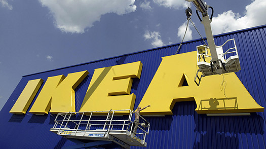
IKEA have undertaken a huge “rebranding” exercise changing their iconic logo. The colours are the same, they haven’t added anything or taken anything away. They have simply decided to change the font from a customised version of Futura to the web friendly Verdana..
With over 300 stores in 37 countries its not going to be a straight forward transition. I would love to hear their reasons behind the change.


