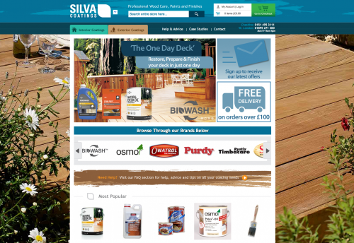
Igoo designed e-commerce site for ‘Silva Coatings’ using Magento system
As the world of e-commerce continues to grow, so do the expectations of the customer. With 60% of customers dumping the content of their baskets before even reaching the checkout, the customer experience while shopping online is the main controllable factor that will get them to the checkout. And with the success of e-commerce websites being easily measured by the amount of completed purchases, the pressure is on for us website designers to make the virtual cash register ring!
With several thriving e-commerce websites under the proverbial igoo belt, here are our top tips in creating online shopping heaven:
- Ease of Navigation Getting the customer to arrive at your site is the first hurdle. Once there, they need to be able to find what they are looking for. Lost customers equals lost sales, so easy navigation is paramount in order to maximise sales from potential customers.The top e-commerce websites all have simple, consistent navigation and excellent customer account facilities (to make repeat ordering simple).
- BrandingCustomers often make their purchasing decisions based on brand identity. This may be an already established brand that sells from a physical location as well as online, or a brand that has just come to market or only sells online. Either way the website must be well-designed to fit in well with the companies overall branding and product.
- Sympathetic DesignApart from being in synergy with the brand, the design is also important in regards to promoting the products on sale. After all the whole purpose of the website is to showcase the goods so that the customer buys it!The customer must connect with the product and relate to it, in order to determine whether it is right for them.Another important factor is that the design should not overpower the products. Instead it should allow the customer to absorb the product features without being distracted by the site design. An extravagant website with flash animation and music may seem eye-catching, but trust us; it will only annoy your visitors as they try to shop. Allow the products to take centre stage and the orders should come flooding through.
- Product PromotionIt may seem obvious, but many e-commerce sites fail to promote their products effectively to visitors. Promoting popular products of interest on the home page can entice shoppers to browse the site further. Placing related products beneath items that customers are browsing is also a good way of encouraging the customer to buy more than they originally intended or did not realise they needed. Finally, allowing the customer to view multiple pictures of the product or to even zoom in on it so they can view detail is a great way of helping the customer determine that the item is what they are looking for.
- Easy CheckoutThree words… KEEP IT SIMPLE! As you can see, to get the customer to the checkout stage is not as easy as you may first think. Once they are here, the last thing they want to do is have to jump through a load of hoops for them to give you their money. Make the transaction process smooth by minimising the steps so that the shopper does not become annoyed or confused and this should lead to a happy purchase for the customer and a sale for you.For an example of us putting our money where are mouth is, we have recently completed a new project for long standing client ‘silva timber’. By following these rules we have been able to create a dedicated Magento site to showcase their range of wood coatings and wood finishes. Our services included website design and development, magento ecommerce, branding and support.


