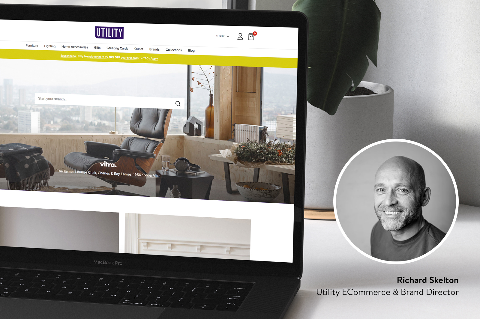
It’s been all hands on deck over the last couple of months as the IGOO team have been working hard on the website re-design and re-development for independent furniture and gift retailer, Utility.

The new website launches with some impressive features including re-designed category and product pages, easily accessible brand specific product pages and an improved navigation structure.
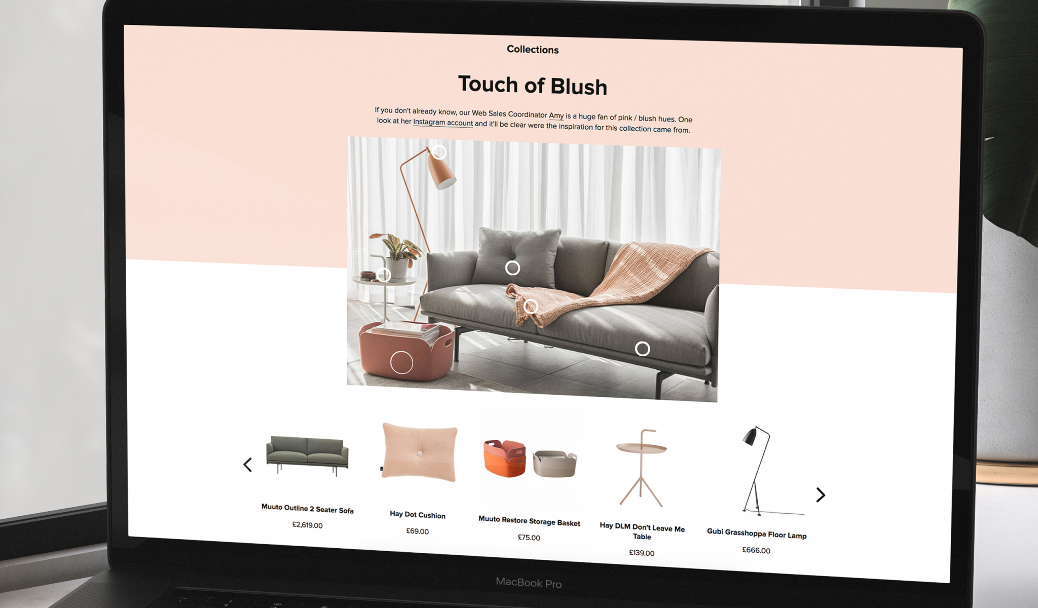
They have also introduced a new ‘Collections’ feature, where the Utility team and some well chosen guests will curate a selection of their favourite products, which are then presented in a shopable format.

Following the website launch, we caught up with Richard Skelton, Director of Utility, to hear his thoughts on the project and their plans moving forward:
What did you want to achieve with this new launch?
As we improve our online brand identity, we wanted to create a better customer user experience and make the site much more mobile friendly. We also wanted to improve mobile conversion rate given high mobile usage on our site.
Which features are you most proud of on the website?
Collections – which create a curated selection of products based on customer and team members’ likes and interior styles. These will be added to as new collections are created and designs are released. Similarly, the integration of our blog ensures brand consistence and enhances the magazine feel of the user experience.
You have two stores based in Liverpool city centre, how does your website work alongside these?
Generally the website is representative of both sides of our business – both furniture, home and lighting and our gift store concept. Whilst our customer range is extremely broad in demographic terms, we plan to develop a separate gift store website based on this design.
In Liverpool, we are generally known as a design led gift retailer whereas online, we’re associated with the contemporary furniture and lighting market. As we focus on both sides of the business and open additional gift stores (we are opening in Manchester later in the year), the new sites will cement our stake in both sectors and help crystallise our future business development.
How have you found using the Magento platform for utilitydesign.co.uk?
Generally we find it very easy. There are without doubt restrictions and we have had to work around certain elements to make the site suit our purpose but, on balance, it works very well for us.
Was it difficult to juggle the project with your existing schedule as a business?
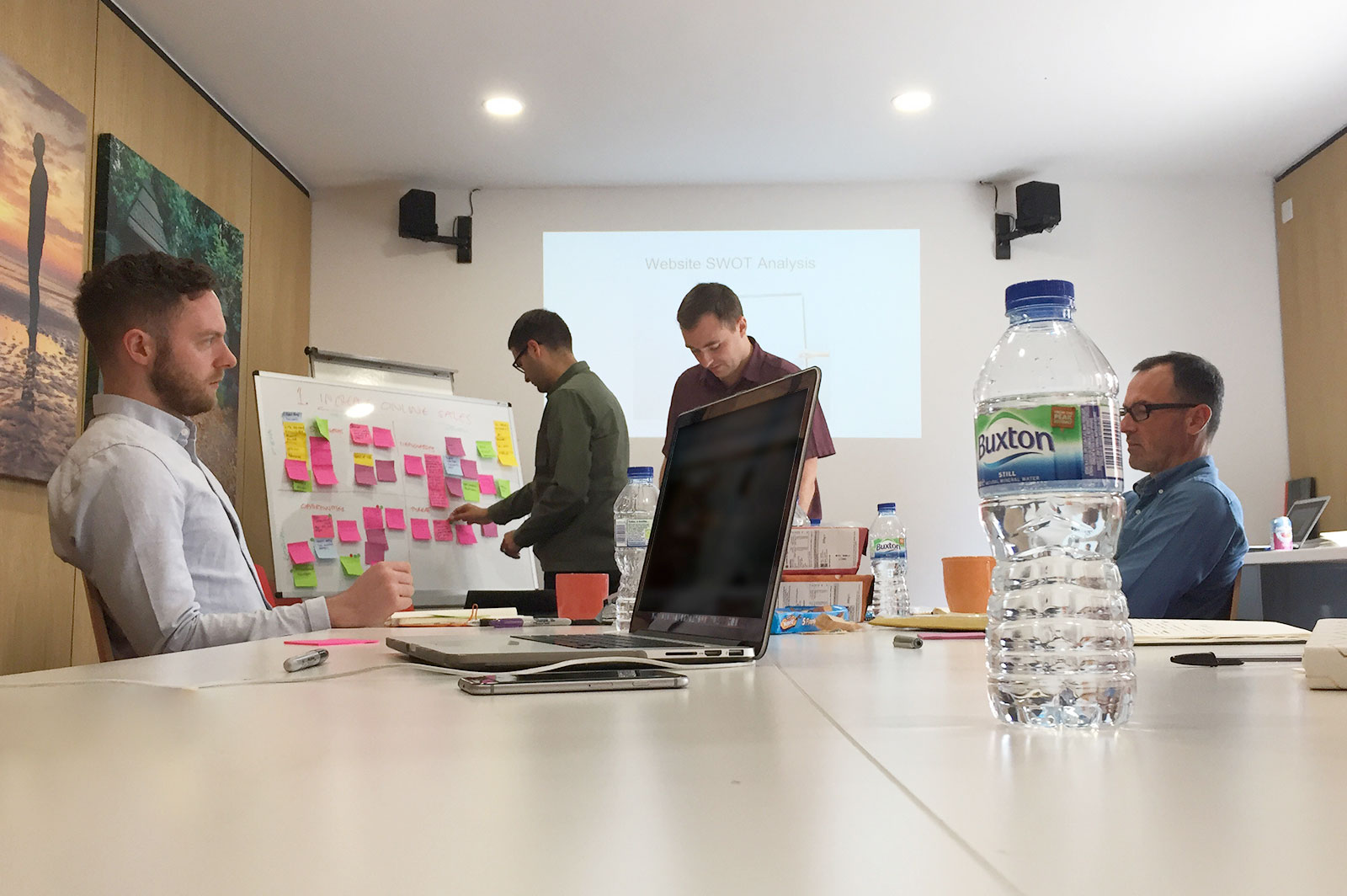
Not really – we scheduled the work in based on a team member by task basis. This ensured all elements were completed in conjunction with our daily workload, without compromising the day to day running of the site.

If you were to give some advice to anyone wanting to start a redesign, what would it be?
Plan, strategise, delegate and be realistic about expectations. Websites, like real stores, need constant updating and this is a moveable feast; any good retailer needs to be on top of in terms of trends, usability and technological development. We are constantly seeking to update and enhance the user experience and this remains a work in progress. A website is never finished so a redesign should not be seen as the completed article.
What made you choose IGOO for the job?
As a Liverpool business, we are passionate about supporting the local economy and championing the north. The guys from IGOO have known our business for years and understand our company DNA.
Whilst we get inundated with development proposals with each one promising more, we feel it’s important for us to work with companies and individuals who understand us as people and share our goals. The guys at IGOO have not promised what they can’t deliver and have surpassed our expectations in the look and feel of the finished website.


